top of page
Groove
Rebranding of A Vinyl Record Store
[ Objective ]
Find a handwritten sign that has varied levels of information, and then develop a cohesive and engaging visual system for the important content in the sign to improve the overall branding. Use graphic design to improve the visual communication of the sign by expanding it into multiple deliverables.
[ Solution ]
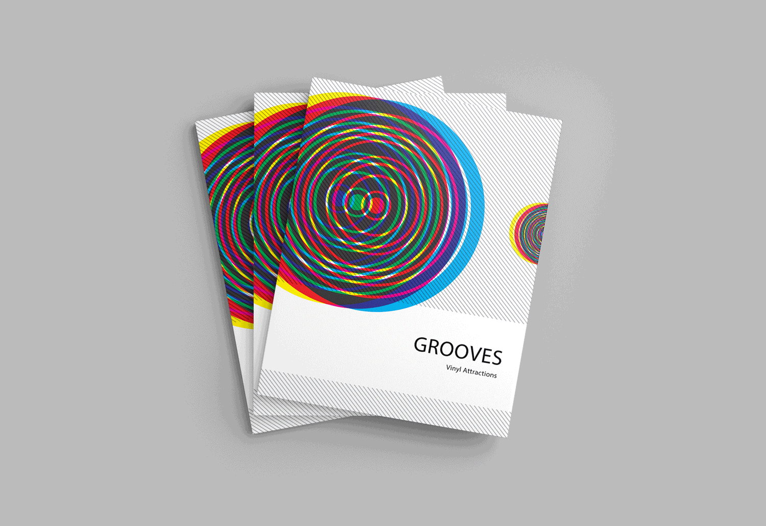
I chose the sign from the Groove, a vintage record store opened in 1996 on Mission street. My strategy was to give the record store a newer, more modern and energetic look by using abstract circles to represent the shape of records, and overlay of vibrant and saturated colors to showcase the excitement of music, and paired with a typeface that was similar to Helvetica.


bottom of page